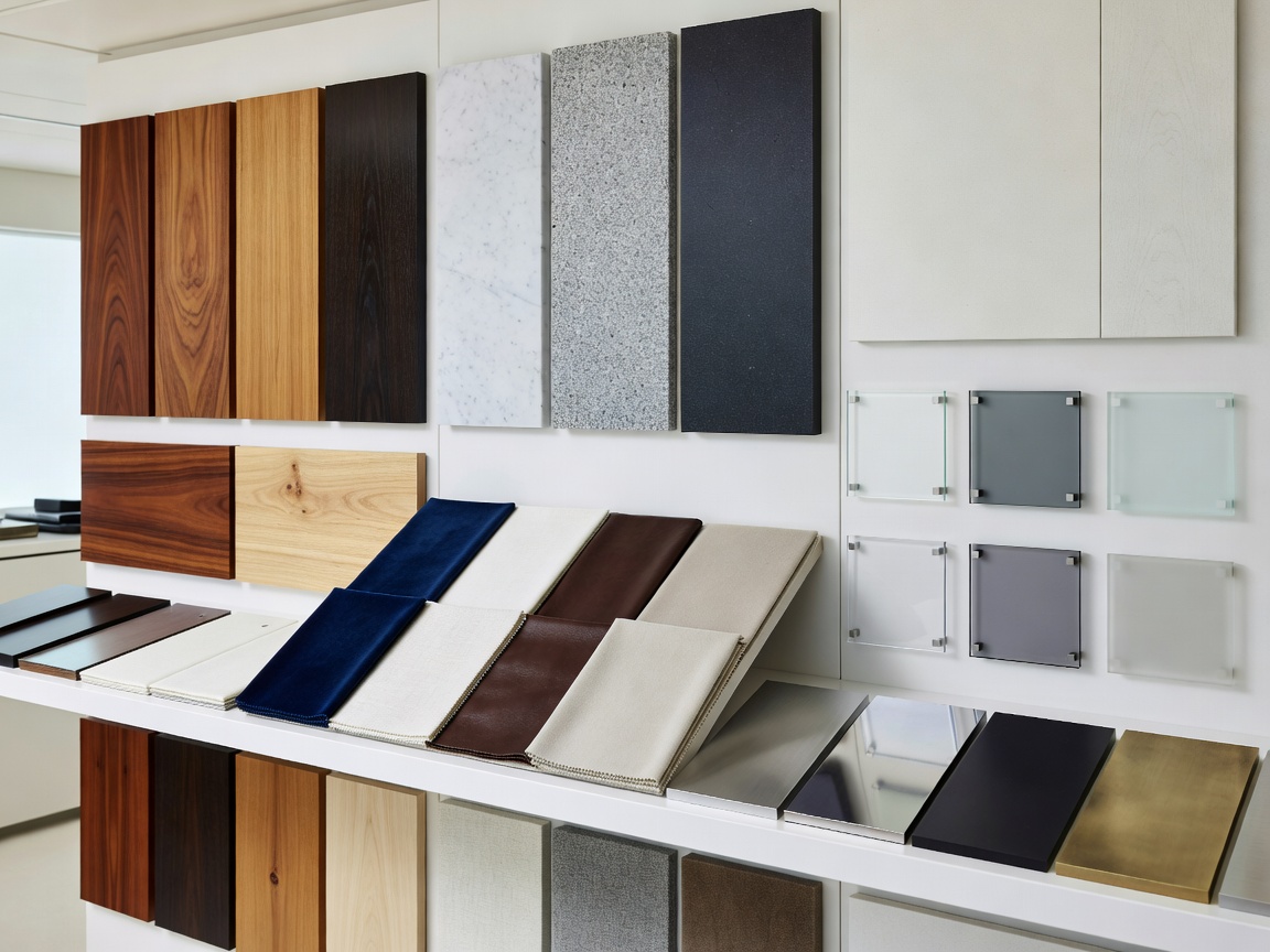
Finish selection is not simply a colour exercise. Teak, veneer, stone, composite surfaces, upholstery, metal, glass, flooring, wall panels and ceiling treatments each bring a different visual and practical character. The strongest schemes are edited rather than crowded.
Timber and veneer
Teak introduces warmth and a recognisable marine reference, while other timber veneers can create a quieter European architectural feel. Grain direction affects the perceived scale of a panel and should be considered across doors, drawers and wall elevations. Veneer is not a single performance category: the substrate, edge treatment and finish system all matter.
Painted or coated joinery can make a cabin feel lighter and provide a controlled background for upholstery and hardware. Matte, satin and higher-sheen treatments reflect light differently. Samples should be viewed beside existing surfaces because a finish that looks soft alone may feel bright next to glass or pale stone.
Stone, composite and flooring
Stone provides depth and natural variation, but slabs, seams, access and handling need to be considered early. Composite surfaces may offer consistency and design flexibility. Neither category should be selected only from a small colour chip; inspect full samples where pattern and repetition affect the room.
Flooring establishes movement through the vessel. Timber, resilient surfaces, carpet and stone each change the sound, warmth and perceived formality of a route. Transitions should be intentional, especially at stairs, bathrooms and exterior doors. The visual line may continue between rooms, but the maintenance needs of each zone can differ.
Soft materials and detail
Upholstery adds comfort and acoustic absorption. Consider texture, seam placement, removable elements and cleaning access. Curtains and wall panels can soften a salon, while headboards and upholstered niches make cabins feel more settled. Glass can open sightlines, but its reflections and edge details should be coordinated with lighting.
Brushed metal, smoked bronze and restrained copper tones work best as punctuation. They can connect handles, lighting, trims and fittings without turning the interior into a collection of unrelated accents. Hardware is part of the finish language and should be reviewed at the same time as the joinery sample.
Coherence across transitions
Material continuity
Repeats a small family of tones and textures throughout connected rooms.
Effect: calm, spacious and architecturally clear.
Consider: varied sheen and texture to avoid a flat result.
Material contrast
Uses selected changes to identify zones or create focal points.
Effect: character and visual hierarchy.
Consider: how many junctions cleaning and maintenance will create.
Weight can be relevant to a vessel, but it is not sensible to make technical claims without the specific structure, installation and project information. Discuss material build-ups with the appropriate marine professionals. The same applies to coatings and adhesives: category names alone do not establish suitability.
A finish schedule should describe appearance, location, edge treatment, cleaning approach and relationship to neighbouring materials. That level of clarity helps everyone make decisions before fabrication and reduces avoidable surprises during installation.